Client
Lokobee | Biztrology Inc.

Overview
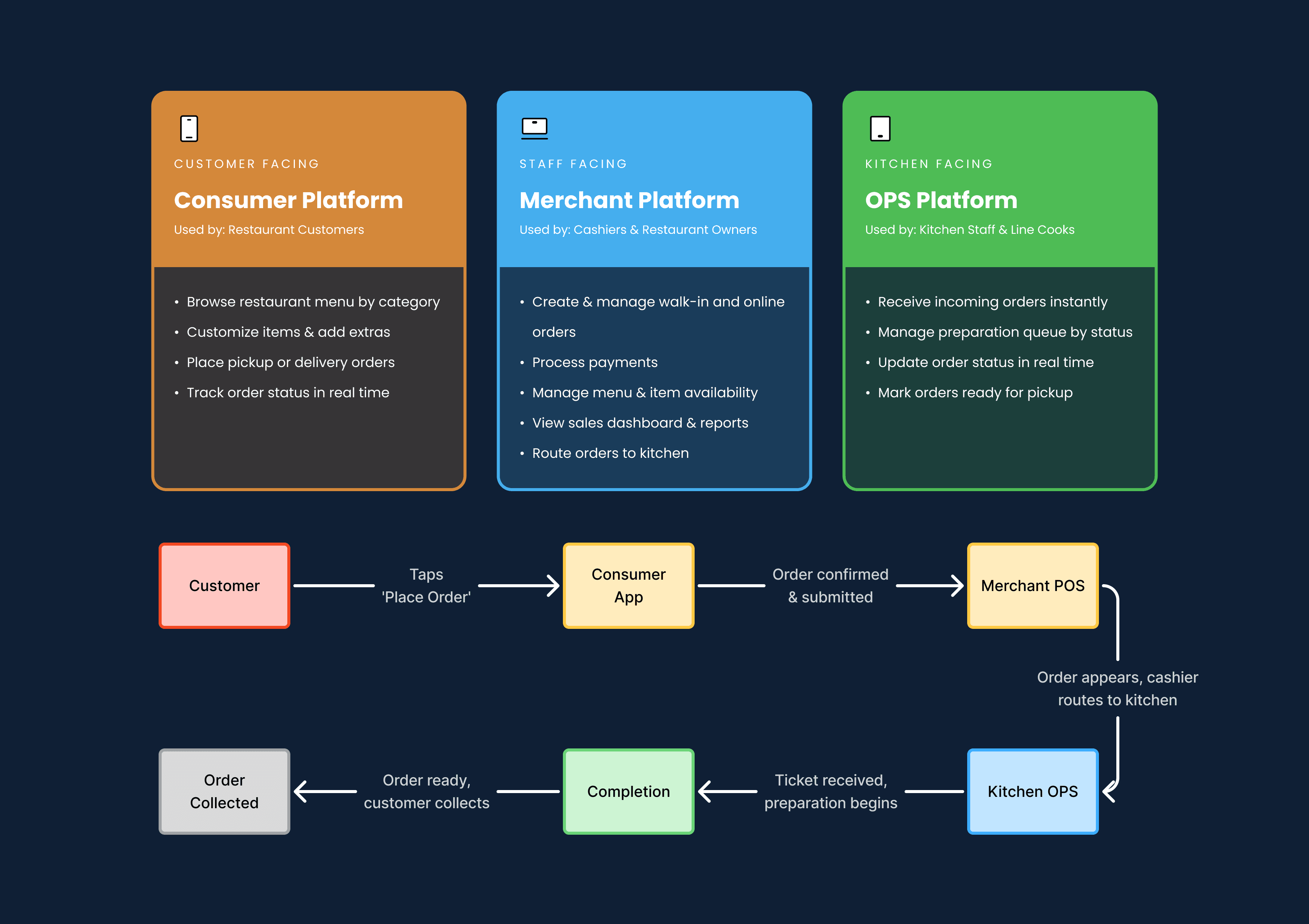
The platform had all the features restaurants needed, but the three systems had been designed independently. The goal was to make them feel like one connected workflow rather than separate tools.
Client
Lokobee | Biztrology Inc.
Industry
Hospitality Industry, Food & Beverage (F&B), Restaurant Technology Sector
Service
UX Strategy
UX Researcher
UI Design
Duration
3 Years


The Challenge
Each user - customer, owner, kitchen staff - had completely different needs and zero tolerance for complexity during a busy service. The biggest issue wasn't any single screen. It was the invisible gaps between the three platforms.

The Solution
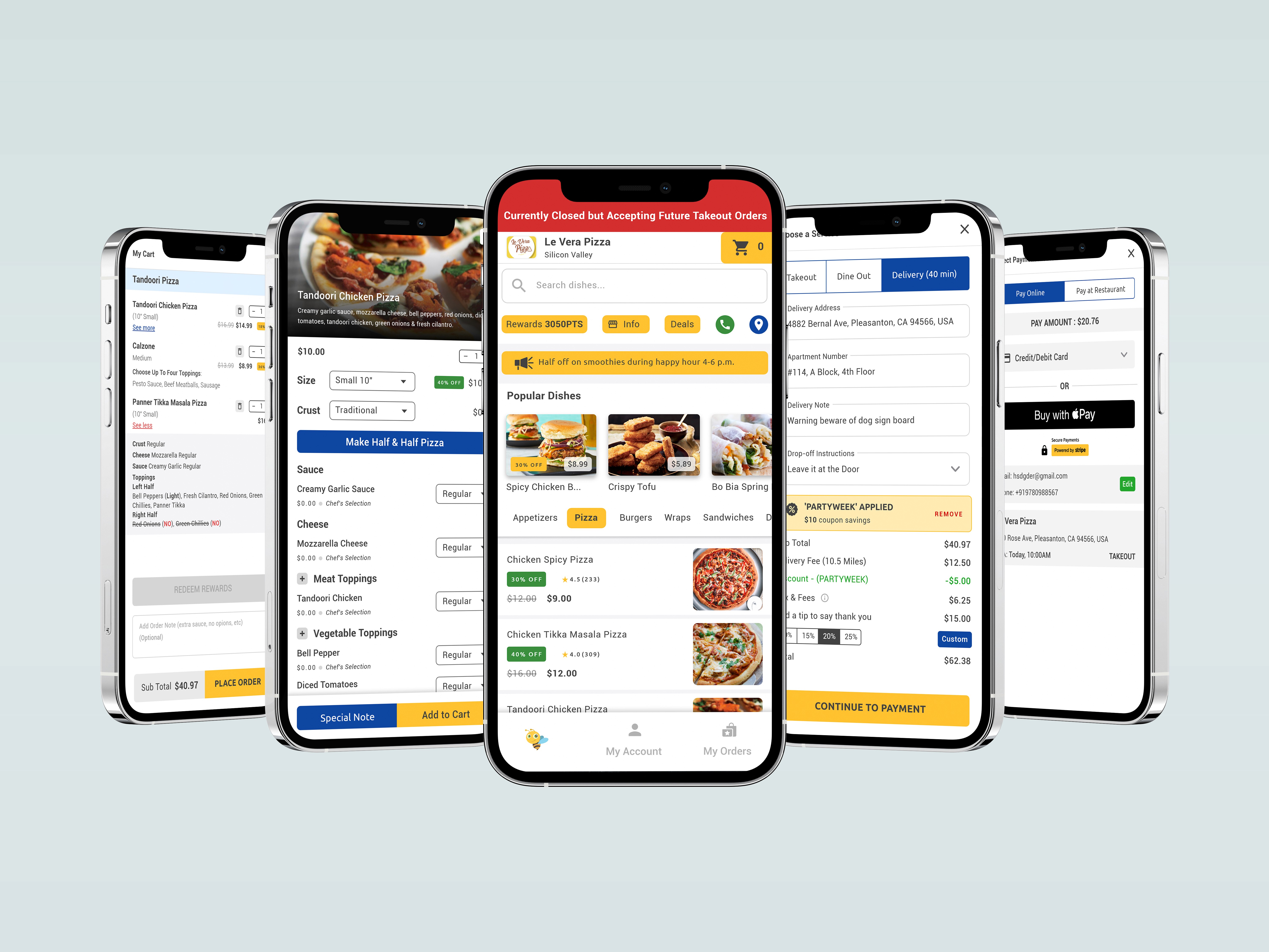
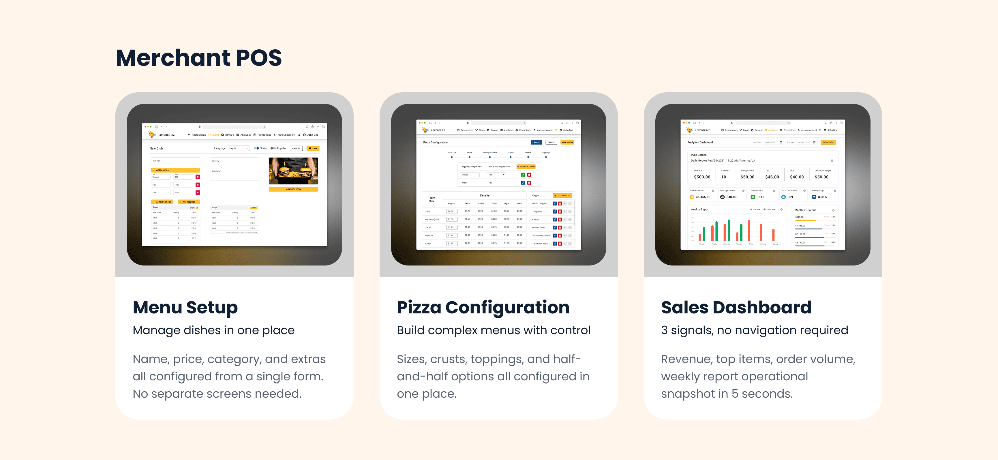
Simplified kitchen order tickets so staff could read them in under 2 seconds. Reduced menu edit steps from 7 to 2. Redesigned the merchant home screen to show live revenue by default. Fixed the consumer checkout flow to remove the moments that caused people to pause or leave.
The Result
Checkout time dropped by 40%. Menu edits went from 7 steps to 2. Owners get today's key numbers in under 5 seconds - no navigation needed. Three platforms, one workflow.

PORTFOLIO

Hestia Case Study
Hestia Case Study
Hestia Case Study
UX Research
User Journey
Wireframing & Prototyping

NatSteel Case Study
NatSteel Case Study
NatSteel Case Study
UI / UX Design
Visual Design
Redesign